"Stella" - UI/UX Case Study
Role: Sole UI/UX Designer
Duration: 4 Weeks
Process: Sitemap, Prototype, UI Design, Interaction
Tools: Pen & Paper, Figma, Photoshop

Project Overview
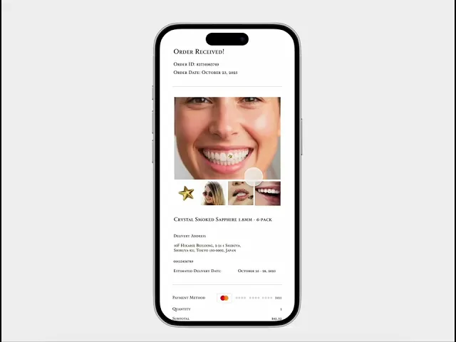
Stella is a luxury-themed dental ornament mobile app designed to help dental clinics showcase their premium dental accessories while allowing users—particularly beauty enthusiasts and younger audiences—to virtually try and purchase them.
The app enables users to browse a curated collection of dental ornaments, capture their own smile, and overlay selected designs to visualize how each piece would look in real life. Users can also contact partner clinic branches directly through the app to book a bonding schedule.

As the UI/UX designer, I was responsible for the entire design process—from competitor research and pen-and-paper ideation to prototyping and interactive design in Figma. I focused on creating an elegant, minimal, and premium experience that reflects the beauty and exclusivity of the product while maintaining intuitive usability.
Issue:
Users can’t easily imagine how dental jewelry would look on their own teeth without actually trying it.
Design Challenge:
How to make the virtual try-on experience accurate, fun, and convincing.
Possible UX solutions:
An AR or photo overlay feature that matches mouth shape and lighting
Option to compare “before” and “after” side by side
Include filters or guides to adjust the overlay realistically
‼️‼️ The Problem
🥸 Checking the 1 and only competitor
Twinkles is a Swedish-based brand that sells high-end dental jewelry (18-24 K gold and lead-free crystals) targeted at beauty-conscious users. They market the product as safe, reversible, and non-invasive (can be bonded and removed by a dental or salon professional) with the taglines like “tooth gems for your smile” and emphasis on a luxury accessory experience.

What Twinkles Does Well
Strong premium branding: Use of “18-24 K gold” and “lead-free crystals” promotes luxury.
Clear product niche: They focus specifically on dental jewelry (gem adornments) which creates a clear identity.
Global shipping & clinic network: They cater internationally and provide a map of providers.
Trust & user reviews: High customer satisfaction (e.g., 4.8/5 rating) builds credibility.
Where Twinkles Leaves Opportunities for Stella
Limited digital experience: Twinkles is more of a product/brand site rather than an interactive app. There’s no full AR-try-on, seamless ordering + clinic scheduling in one mobile app.
User retentions & engagement gap: The emphasis is purchase + adornment rather than a recurring digital experience.
Localized adaptation: Twinkles is global but may lack region-specific flows (e.g., Japanese market, language, cultural styling).
Checkout to application friction: Users buy the gem then go to a clinic; Stella can streamline the bonding scheduling, try-on, ordering in-app.
Luxury digital interface gap: While the product is luxury, there’s room for a high-end UX/UI app experience that aligns with younger beauty-oriented audiences (like yours).
What Went Through My Mind
Before jumping into digital design, I started by sketching ideas on paper to visualize how users might explore and interact with the app. I wanted Stella to feel luxurious yet approachable — something elegant enough to reflect premium dental ornaments, but simple enough for everyday users to navigate easily.
During this stage, I focused on structuring the main user flow: browsing ornaments, trying them virtually, and contacting nearby clinics. My goal was to design a smooth and visually balanced experience that would make users feel confident and curious about exploring dental jewelry.


When I first started designing Stella, I asked myself: “How can I make dental ornaments feel luxurious, not intimidating?”
I began with pen and paper sketches, exploring layouts and visual elements that felt elegant but modern. I played with the idea of blending beauty and dentistry — a clean interface that highlights the sparkle of the ornaments while keeping the experience fun and premium. These sketches helped me map out how users would browse, try on, and connect with clinics naturally.
I began with quick sketches to organize my thoughts and visualize the user journey. My main focus was balancing luxury and usability — creating an interface that feels premium but stays intuitive. The sketches helped me translate abstract ideas into a clear structure before moving to digital wireframes.
Wireframing
After finalizing the initial sketches, I moved on to digital wireframes in Figma. During this stage, I held a meeting with the founders to present the app’s core layout and user flow. We discussed key screens such as the ornament browsing page, AR preview, and clinic contact feature.
Their feedback helped refine the structure — especially on how users transition between browsing and trying ornaments. By aligning design decisions with their business goals, I ensured the wireframes clearly communicated both the luxury brand image and intuitive usability.


I turned my sketches into wireframes using Figma and presented them to the founders to gather feedback. We discussed the overall flow, design hierarchy, and how to make the app both elegant and easy to use. Their feedback helped refine the structure before moving into high-fidelity design.
Interface Design
For the Stella project, I focused on creating an interface that is both clean and intuitive, making it easy for users to navigate while keeping the visuals appealing. A big part of this was designing the UI components. I built reusable elements like buttons, cards, input fields, and navigation items, keeping spacing, colors, and typography consistent throughout. This modular approach made it easy to adapt components for different screens without breaking the overall design. I also paid attention to interaction details, buttons and toggles have clear feedback states, and icons and labels guide users naturally through tasks. Organizing the components carefully not only sped up the design process but also made collaboration with developers smoother, as everything was easy to understand and implement.


The Prototype
After finalizing the components, I moved on to building the main prototype, where all the elements came together as a complete, interactive experience. This stage focused on bringing the app’s flow to life, connecting screens, refining transitions, and ensuring that every interaction felt natural and intuitive. I paid close attention to details like hierarchy, spacing, and visual rhythm to create a sense of balance and continuity throughout the interface.
Conclusion
Working on the Stella project taught me a lot about the importance of structure and intention in design. From building reusable components to refining the final prototype, I learned how every small detail, spacing, color, interaction, plays a big role in the overall experience. It also reminded me that good design isn’t just about how things look, but about how smoothly they work together for the user.
Through this project, I became more confident in managing design systems, improving collaboration with developers, and turning ideas into something that feels real and usable. Overall, Stella helped me grow not just as a UI designer, but as someone who values both creativity and practicality in every design decision.
"Stella" - UI/UX Case Study
"Stella" - UI/UX Case Study
Role: Sole UI/UX Designer
Duration: 4 Weeks
Process: Sitemap, Prototype, UI Design, Interaction
Tools: Pen & Paper, Figma, Photoshop
Project Overview
Project Overview
Stella is a luxury-themed dental ornament mobile app designed to help dental clinics showcase their premium dental accessories while allowing users—particularly beauty enthusiasts and younger audiences—to virtually try and purchase them.
The app enables users to browse a curated collection of dental ornaments, capture their own smile, and overlay selected designs to visualize how each piece would look in real life. Users can also contact partner clinic branches directly through the app to book a bonding schedule.
As the UI/UX designer, I was responsible for the entire design process—from competitor research and pen-and-paper ideation to prototyping and interactive design in Figma. I focused on creating an elegant, minimal, and premium experience that reflects the beauty and exclusivity of the product while maintaining intuitive usability.
Issue:
Users can’t easily imagine how dental jewelry would look on their own teeth without actually trying it.
Design Challenge:
How to make the virtual try-on experience accurate, fun, and convincing.
Possible UX solutions:
An AR or photo overlay feature that matches mouth shape and lighting
Option to compare “before” and “after” side by side
Include filters or guides to adjust the overlay realistically
‼️‼️ The Problem
🥸 Checking the 1 and only competitor
Twinkles is a Swedish-based brand that sells high-end dental jewelry (18-24 K gold and lead-free crystals) targeted at beauty-conscious users. They market the product as safe, reversible, and non-invasive (can be bonded and removed by a dental or salon professional) with the taglines like “tooth gems for your smile” and emphasis on a luxury accessory experience.
What Twinkles Does Well
Strong premium branding: Use of “18-24 K gold” and “lead-free crystals” promotes luxury.
Clear product niche: They focus specifically on dental jewelry (gem adornments) which creates a clear identity.
Global shipping & clinic network: They cater internationally and provide a map of providers.
Trust & user reviews: High customer satisfaction (e.g., 4.8/5 rating) builds credibility.
Where Twinkles Leaves Opportunities for Stella
Limited digital experience: Twinkles is more of a product/brand site rather than an interactive app. There’s no full AR-try-on, seamless ordering + clinic scheduling in one mobile app.
User retentions & engagement gap: The emphasis is purchase + adornment rather than a recurring digital experience.
Localized adaptation: Twinkles is global but may lack region-specific flows (e.g., Japanese market, language, cultural styling).
Checkout to application friction: Users buy the gem then go to a clinic; Stella can streamline the bonding scheduling, try-on, ordering in-app.
Luxury digital interface gap: While the product is luxury, there’s room for a high-end UX/UI app experience that aligns with younger beauty-oriented audiences (like yours).
What Went Through My Mind
Before jumping into digital design, I started by sketching ideas on paper to visualize how users might explore and interact with the app. I wanted Stella to feel luxurious yet approachable — something elegant enough to reflect premium dental ornaments, but simple enough for everyday users to navigate easily.
During this stage, I focused on structuring the main user flow: browsing ornaments, trying them virtually, and contacting nearby clinics. My goal was to design a smooth and visually balanced experience that would make users feel confident and curious about exploring dental jewelry.
When I first started designing Stella, I asked myself: “How can I make dental ornaments feel luxurious, not intimidating?”
I began with pen and paper sketches, exploring layouts and visual elements that felt elegant but modern. I played with the idea of blending beauty and dentistry — a clean interface that highlights the sparkle of the ornaments while keeping the experience fun and premium. These sketches helped me map out how users would browse, try on, and connect with clinics naturally.
I began with quick sketches to organize my thoughts and visualize the user journey. My main focus was balancing luxury and usability — creating an interface that feels premium but stays intuitive. The sketches helped me translate abstract ideas into a clear structure before moving to digital wireframes.
Wireframing
After finalizing the initial sketches, I moved on to digital wireframes in Figma. During this stage, I held a meeting with the founders to present the app’s core layout and user flow. We discussed key screens such as the ornament browsing page, AR preview, and clinic contact feature.
Their feedback helped refine the structure — especially on how users transition between browsing and trying ornaments. By aligning design decisions with their business goals, I ensured the wireframes clearly communicated both the luxury brand image and intuitive usability.
I turned my sketches into wireframes using Figma and presented them to the founders to gather feedback. We discussed the overall flow, design hierarchy, and how to make the app both elegant and easy to use. Their feedback helped refine the structure before moving into high-fidelity design.
Interface Design
For the Stella project, I focused on creating an interface that is both clean and intuitive, making it easy for users to navigate while keeping the visuals appealing. A big part of this was designing the UI components. I built reusable elements like buttons, cards, input fields, and navigation items, keeping spacing, colors, and typography consistent throughout. This modular approach made it easy to adapt components for different screens without breaking the overall design. I also paid attention to interaction details, buttons and toggles have clear feedback states, and icons and labels guide users naturally through tasks. Organizing the components carefully not only sped up the design process but also made collaboration with developers smoother, as everything was easy to understand and implement.
The Prototype
After finalizing the components, I moved on to building the main prototype, where all the elements came together as a complete, interactive experience. This stage focused on bringing the app’s flow to life, connecting screens, refining transitions, and ensuring that every interaction felt natural and intuitive. I paid close attention to details like hierarchy, spacing, and visual rhythm to create a sense of balance and continuity throughout the interface.
Conclusion
Working on the Stella project taught me a lot about the importance of structure and intention in design. From building reusable components to refining the final prototype, I learned how every small detail, spacing, color, interaction, plays a big role in the overall experience. It also reminded me that good design isn’t just about how things look, but about how smoothly they work together for the user.
Through this project, I became more confident in managing design systems, improving collaboration with developers, and turning ideas into something that feels real and usable. Overall, Stella helped me grow not just as a UI designer, but as someone who values both creativity and practicality in every design decision.