


Role: Sole UI/UX Designer
Duration: 3 Weeks
Process: Sitemap, Prototype, Wireframing, UI Design
Tools: Pen & Paper, Figma
The original Naganuma School website felt outdated and wasn’t giving off the best impression to potential international students. It looked like a "mukashi no website", with confusing navigation and a layout that didn’t reflect the school’s vibrant and welcoming environment. As part of this redesign, I focused on creating a cleaner, more modern UI that feels both trustworthy and student-friendly. I reorganized the content, added clear call-to-action buttons, and designed layouts that highlight the school’s offerings and culture. This redesign aims to help users—especially non-Japanese speakers—easily find what they need and feel more confident about choosing Naganuma School.
The Naganuma School’s official website had an outdated look and feel that made it difficult for users—especially international students—to navigate and understand important information. The layout was cluttered, the design lacked visual hierarchy, and much of the content wasn’t easily accessible or user-friendly. This created confusion and reduced the site’s overall credibility, potentially discouraging prospective students from learning more or applying. A redesign was necessary to improve both usability and visual appeal.
The current Naganuma School website exhibits limited mobile responsiveness. While the desktop layout is functional, several elements — such as navigation menus, text scaling, and image placement — do not adapt seamlessly to smaller screens. As a result, users on smartphones or tablets may experience inconsistent spacing, overlapping text, or the need for excessive scrolling and zooming, which negatively impacts usability and readability.
According to GTmetrix, the Naganuma School website scores a D grade (Performance: 57%, Structure: 79%), with an LCP of 5.2 seconds, indicating slow loading speed for key content. While layout stability and script performance are strong (TBT 0ms, CLS 0), the site lacks proper speed optimization, particularly for mobile users.
Large image files, outdated caching practices, and potential server inefficiencies are likely contributors.
Addressing these would significantly enhance mobile accessibility, international reach, and overall user experience.
When I started creating the components for the Naganuma School redesign, my mission was clear: no more buttons that look like they were made in Microsoft Word. I broke down the UI into reusable pieces—headers, footers, course cards, FAQ sections—basically, everything that needed a glow-up. Each component was crafted to feel clean, modern, and functional (without giving off that “just learned HTML yesterday” vibe). It was like playing with Lego blocks, but for grown-up designers who are very allergic to Comic Sans and neon gradients. In the end, the components came together into a layout that’s actually pleasant to look at—and easy to use.
Before diving into the fancy visuals, I started with wireframes—basically the skeleton of the site. Think of it like sketching a house before buying the furniture. I mapped out where each section should go, focused on clear user flow, and made sure important info like courses, application steps, and contact details were front and center. No distractions, no decorations—just pure structure. It was a great way to test out layout ideas and fix any “wait… where am I?” moments before adding color and polish. Bonus: I didn’t waste time designing a pretty layout that didn’t work.
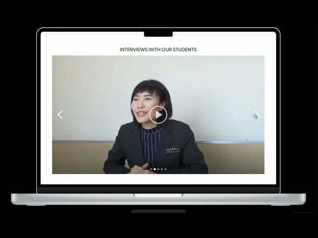
Behold—the final prototype! After rounds of planning, wireframing, and telling outdated UI elements to politely leave, the Naganuma School website finally got its well-deserved glow-up. The layout is clean, the navigation actually makes sense, and the fonts no longer scream "Internet Explorer era." I made sure everything looked great on both desktop and mobile (because yes, people do check school sites on their phones while half-asleep). It's modern, easy to use, and no longer feels like you’ve been transported back to 2004. Mission accomplished!
Redesigning the Naganuma School website was definitely a mix of challenges and "aha!" moments. It pushed me to really think about how users navigate school websites—especially international students who might already be overwhelmed. From organizing the content better to making sure everything feels approachable and modern, this project helped sharpen my eye for structure and usability. Looking back, it was honestly satisfying to turn something that felt outdated into a site that actually works and feels good to use. Would I do it again? Absolutely—but maybe with a little less coffee next time.